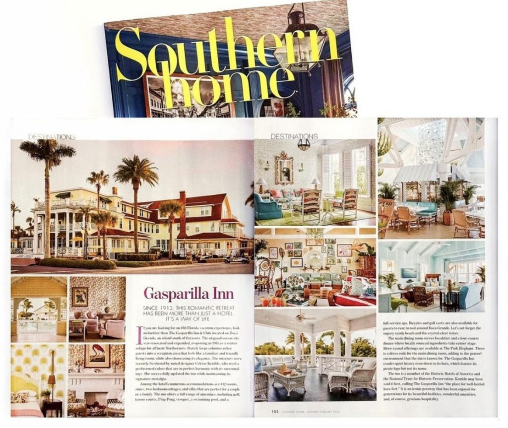
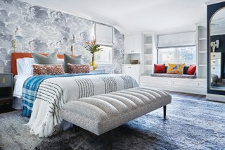
The Gasparilla Inn & Club is the perfect destination for those looking for a sunny respite with an Old Florida feeling and updated and inviting interiors by noted designer Celerie Kemble.
The profile appears in the Jan/Feb 2024 edition of Southern Home magazine.
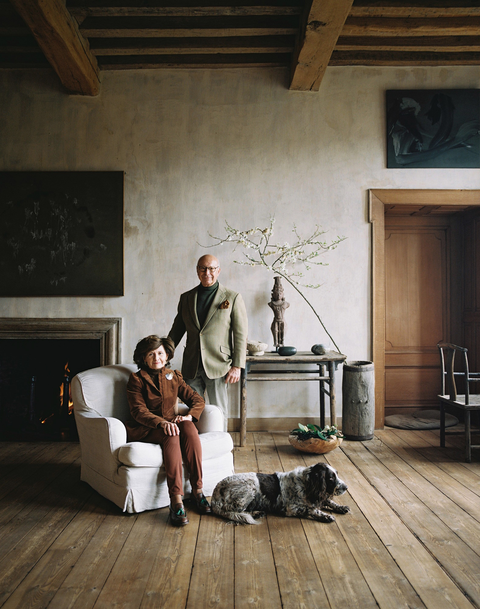
Axel Vervoordt is a man with many hats: art and antiques dealer, interior designer, initiator of groundbreaking exhibitions and an impresario of musical, artistic and architectural experiences. Central to all this activity is his long marriage to his wife, May. Their evolving interests have been the guiding thread in their esteemed family business. Whether in their private home, the 12th-century Kasteel van ‘s-Gravenwezel, outside Antwerp, or in their impressive business headquarters, Kanaal—a restored late-19th-century distillery and malting complex on the nearby Albert Canal—their shared aesthetic and philosophical values are expressed in every atmospheric interior and the juxtaposition of carefully selected artworks. It is appropriate, therefore, that as Axel and May celebrate their 50th wedding anniversary this spring, they have created a book about their collecting.
Axel and May Vervoordt in their home near Antwerp
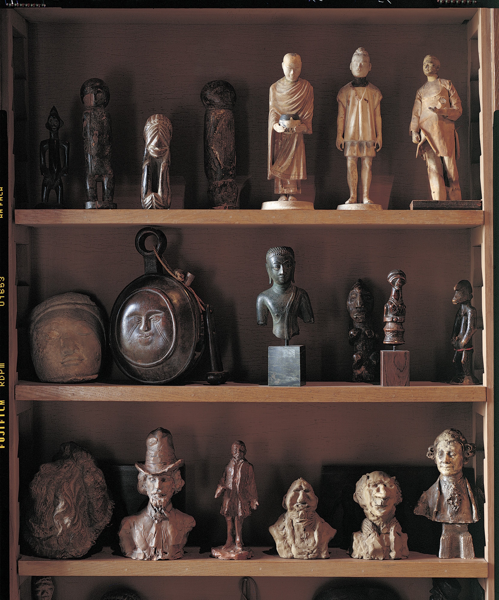
What has interested them above all on this journey has been a dialogue between traditions—the exchange between east and west—which is reflected throughout their home and in their exhibition-making. It is also expressed in this new book, which celebrates artworks from contrasting traditions to emphasize continuities of thought and feeling. For Axel, his touchstones include works by Kazuo Shiraga and the numinous Fontana sculpture Concetto Spaziale, Natura, 1959–60. May has a favorite painting—Urbino, 1978, by Belgian artist Jef Verheyen, known for his exploration of light, color and geometry. She also loves the Japanese Head of a Lohan, or Buddhist monk on the edge of enlightenment, in their library: “Every time I see them, I learn something new.”
This interest in Asian art can be traced to their friendship with Dr Jos Macken, a neurologist who was a great friend of Verheyen and a passionate collector of eastern art. Through Macken, Axel became interested in eastern philosophy, especially the Japanese concept of wabi-sabi: the wisdom of imperfection. Axel explains that his mother instilled in him a feeling for “the beauty of simplicity—she liked very humble things”.
A collection of figurines in the library
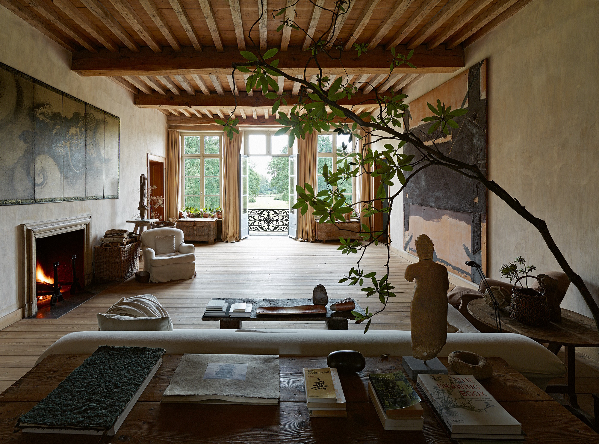
Axel and May had visited Japan before they married and, from their late twenties, traveled through Thailand, China and Japan, developing a passionate understanding of Zen philosophy, ceramics, sculpture and calligraphy. Furthermore, Axel eagerly discovered the East Asian idea of the “void”—a potent emptiness; a latent creative energy beyond human comprehension.
Through Verheyen, the couple discovered the broad network of European artists connected to the Zero movement in Germany, including the Argentine-Italian Lucio Fontana and the German Günther Uecker, who were exploring similar ideas. Axel remarks: “After the terrible destruction of the Second World War, the idea of starting again from nothing was very appealing.”
The “Oriental Salon” at Kasteel van ‘s-Gravenwezel, with a 17th-century Japanese folding screen by Tan’yu Kano (left) and Fusta i Marró Forodat by Antoni Tàpies, 1972 (right)
These ideas were all percolating in the Vervoordts from the beginning of their relationship. They met when they were very young. May reports that Axel, then aged 21, “was a young antiques dealer,” while her interests, as a student of graphic design aged 18 or 19, “were more contemporary.” One of Axel’s early purchases—an oil painting by René Magritte of his famous motif, La Mémoire, 1948—suggests that he was always looking for a sense of “timelessness, the universal”. In addition, what was evident in their shared preferences was that, “the things we loved and bought, they had a sense of silence. They were never aggressive,” says May.
Axel Vervoordt seized upon dealing as a means of exploring his own interests in art. What he bought was always something that he and May loved: “I had to feel it in my breast,” he says.
The loft in the outer buildings of the castle. An Artempo disc by Axel Vervoordt hangs above painted works by Gutai artist Sadaharu Horio. Signal by Takis, 1958, is on the table.
In 2005, Axel discovered the Gutai artists in Japan. Alongside Fontana, Shiraga in particular is an essential reference for them both. May comments: “You feel strength in this art, but with that, a meditative feeling. You see the movement in a Shiraga painting, but recognize the stillness that came before.”
Both agree that they will never stop collecting. May refers to one of her favorite works, a six-fold Japanese screen from the 17th century, decorated with round stepping stones, black and white, with the motto: “By this way, bring you luck.” Collecting has become a series of steps, May explains. “There is an evolution. You continue to look and to buy.”
Color can set the tone for an entire room, whether you want to ramp up the energy for lively dinner conversation, or create a zen-like sanctuary for relaxation.
Pantone, the world’s foremost authority on color trends, has released their predictions for the top shades for 2022. Their palette brings together comforting neutrals and delightful pops of bold colors in unexpected ways. Pantone’s report showcases a diverse collection of color to reflect a global desire for calm combined with a sense of optimism, joy, and adventure.
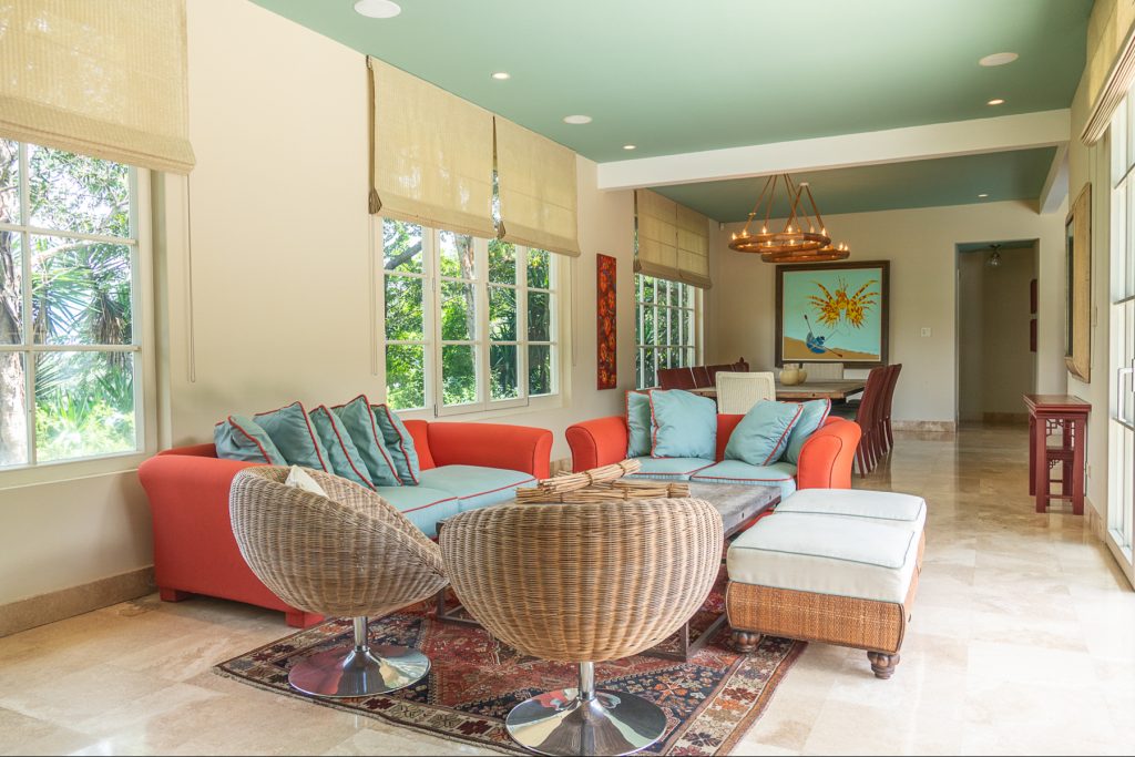
Upholstery that pairs hot Poinciana red-orange with cool Spun Sugar blue creates a focal point in this seating area that practically vibrates with energy. The tailored piping ties the colors together in a joyful pairing, while the soothing ceiling shade of Basil adds a sophisticated touch that balances the entire scene. Walls are reminiscent of Perfectly Pale, an updated beige that creates the perfect backdrop for playing with bolder colors.
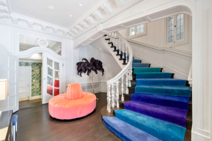
The ombre carpet runner on the stairs is a sumptuous addition to this Parisian-style residence in San Francisco. It cascades in rich jewel tones that include trending Skydiver and Harbor Blue. The inviting accent chair with its nod to Gossamer Pink provides a truly unexpected contrast and proves that the pastels of 2022 can deliver rich context within a modern color scheme.
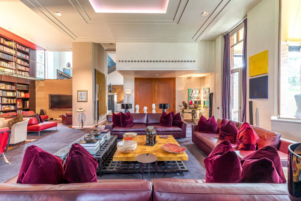
If there was ever a color that injected both fun and regality into a room, it’s Dahlia. The deep violet-plum provides a refreshing focus in this inviting living room. Lush velvet pillows offer both comfort and luxury with a splash of Innuendo when the light hits just right, while the wood tones on the grand double-door keep everything grounded with the right balance of warmth and welcome.
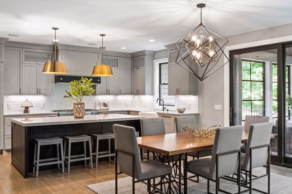
In contrast to high-energy primary colors and jewel tones, the other half of this year’s color palette focuses on restful neutrals for timeless sophistication. In this chic kitchen, the Snow White wallpops against cabinets painted the pale gray of Northern Droplet. This shade is matched in the bar stools and dining chair upholstery, where it plays against the deeper tones of the Poppy Seed-inspired island and cool metallic frames of the dining furniture.
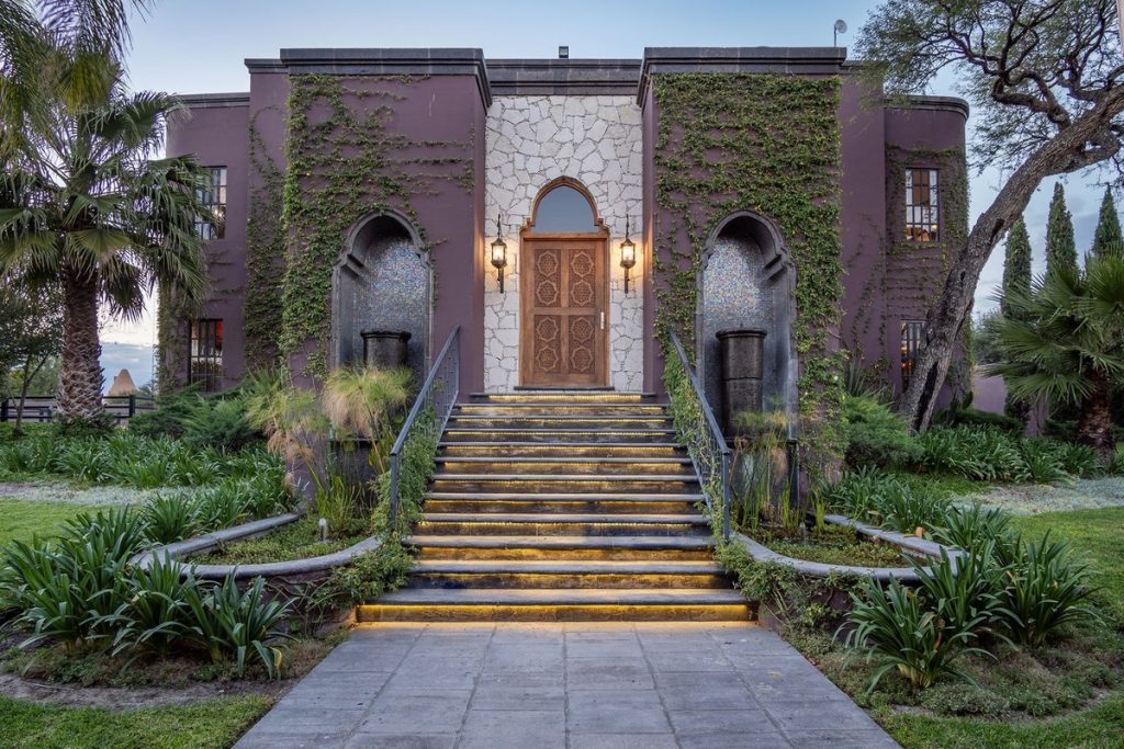
This charming estate takes a cue from Pantone’s warm Coca Mocha for a natural exterior that harmoniously complements the property’s lush landscape. The earthy tone lends itself beautifully to contemporary Moroccan architecture and the front door’s impressive wooden carving. Whether strolling through the courtyards or relaxing poolside, the home’s espresso hue offers a welcome sense of calm, and proves that color trends aren’t just a consideration for interior design.
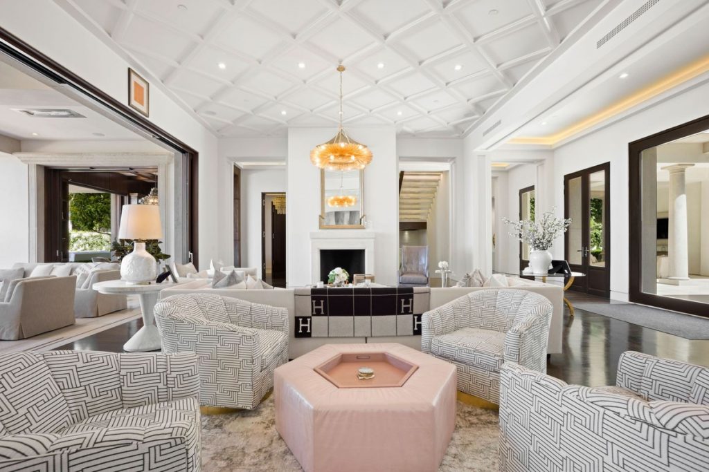
Snow White shines in this bright living room, which gains interest from its playful use of geometry: diamonds on the ceiling, mod patterning on the tub chairs, and the hexagonal coffee table at the center. That pièce de résistance is decked out in this season’s best pastel, Gossamer Pink. The whole result is a mesmerizing study in texture and color that’s also highly livable.
Pantone’s color trend predictions for spring 2022 highlight what’s best about the current design moment: the timeless comfort of neutrals and the irrepressible joy of bright, bold hues. Taken together, the possibilities for creating a unique living space are endless.
A truly inspired interior isn’t just something pretty to look at, it’s an immersive experience felt through every sense—including touch. The plushness of a shaggy rug underfoot, the splendor of running your fingers through a faux fur hide, the cozy lure of a hand-knit ottoman—by incorporating texture and tactility into your design, the look and feel becomes interactive. “Careful and thoughtful layering of a space makes a room come alive,” says Rome, Italy-based architect and designer Achille Salvagni. “Alongside color and materials, tactile elements are extremely important. These are the details that can complete a room and transform it from a clinical, sterile environment into a warm and inviting space,” he says.
Tactility can be expressed in many ways, through textured fabrics and materials, through the art of layering, whether rugs or throw blankets, or through accents and artwork that bring a sense of warmth and depth to a room. “It is important to mix the ingredients in the same way a chef creates a perfect dish, bringing all the flavors together in a harmonious balance,” Salvagni says. Contrasts between hard and soft finishes and light and dark colors are essential. And the room shouldn’t be too crowded—individual pieces need to be able to breathe and stand out on their own, Salvagni says.
Achille Salvagni, who designed the room below, says tactile elements can complete and transform a room into a warm, inviting space.
Focus on Fabrics and Finishes
The fabrics and textiles you choose are key to creating a sense of tactility. Los Angeles-based interior designer Peti Lau uses plush fabrics, such as cashmere, velvet, and mohair, to add softness to a room. “It’s the same feeling when you put on a high-quality cashmere sweater—it’s just so yummy—the same goes for designing a room with fabrics that are super soft to the touch,” she says. Cashmere can be applied as window treatments. “It drapes beautifully, is incredibly soft, and the consistency of color can be very soothing and set the tone of the room,” Lau says. Lush fabrics such as velvet, embroidery, or silk also work well for drapery.
Woven fabrics, such as mohair, are a great way to introduce textures. They lend incredibly rich color to an upholstery piece and are very durable, Lau says. She also loves to use Mongolian cashmere or a sheepskin rug in a bedroom. “It’s a fantastic way to be connected to your senses—waking up and the first thing your feet touch is that soft, plush rug,” she says. Rugs can also be layered—a faux fur hide over a natural fiber, for example. Designers Michael Violante and Paul Rochford of Violante & Rochford Interiors in Santa Fe, N.M., create a sense of touch in a room by incorporating upholstery on chairs, sofas, ottomans, and lampshades, and through artwork and antiques, wallpaper, glass and steel tables, baskets, and other woven materials like seagrass. They also love to use textiles, such as Navajo rugs, as wall hangings. Tactile finishes aren’t just limited to fabrics, upholstery, or rugs. They can also be applied to walls. Salvagni suggests using alpaca or bronze wall panels.
Nubby wallpaper, plaster-style wall treatments, upholstered pieces, textured tile or wood flooring, and light fixtures are some of the ways you can add a palpable touch to a space, says Nina Magon, founder and principal of Nina Magon Studio in Houston.
Magon first considers the use, durability, and location of the tactile piece itself. “It can be beautiful and add interest, but if it does not wear well, or doesn’t feel good, i.e., fabric that is coarse or scratchy, then it is not functional,” she says.
A bedroom by Peti Lau combines textures and colors.
Look to Layering
Layering touchable surfaces adds more interest and depth within your design. For example, using a range of different fabric throw pillows on your sofa will create beautiful layers and add interest for the eye with a range of textures, Magon says.
Salvagni chooses to layer natural textiles including sheepskin, wool, mohair, and velvet, and then adds throw pillows—all while introducing other materials like parchment, bronze, fine woods, marble, onyx, and Murano glass in the way of furniture and accessories in other areas of the room. Rugs, whether hand-tufted wool or silk, against a hardwood or stone floor for contrast, are another way Salvagni adds a tangible quality. “Each of these has a different feel and can help the ambience change during the day along with different levels of light,” he says.
Successfully layering is all about contrasting different elements, say Violante and Rochford. “You don’t want rugs to be too bulky, or accent pieces to be overwhelming; a balance between all the different textures will give you an environment that is comfortable yet stylish, with a bit of depth—and the effect of many things pulled together to create one unified feeling or experience.”
Salvagni creates harmony between textures and colors. “You can have contrast, but it must be balanced and resonate with something else in the room,” he says.
Create Balance
Balancing smooth surfaces with textured ones is key, Magon says. Color and texture are also important. “Make sure the color and texture of your tactile surfaces blend with the other elements in your space so everything feels cohesive,” she says.
Violante and Rochford opt for soft, sheer window treatments along with stone or wood on the floor with a rug adding into the mix. “What you want is a lush, elegant tactile experience that works harmoniously,” they say.
To keep a space balanced, Salvagni uses natural materials for upholstery along with velvet and mohair. “Velvet curtains can be used to lend a sense of drama and grandeur or on the contrary, silk or sheer curtains give lightness to a room,” he says. “Colors, materials, and textures will bring all the pieces together.”
A chic yet warm room designed by Violante & Rochford Interiors.
Since its 1913 remodel, the Gasparilla Inn & Club has been a power hub in the sleepy village of Boca Grande, located on a barrier island between Naples and Sarasota. Titans of industry like J.P. Morgan and Henry Ford vacationed there, as did Hollywood elite like Katherine Hepburn. But after a century of vacationers, the shabby-chic transomed rooms (sans air conditioning), peanut butter and bacon canapes at cocktail hour, and a strict, clubby dress code, were in need of a refresh. The designers to call? Interior design duo Palm Beach native Mimi Maddock McMakin, Cece Bowman and Mackenzie Hodgson of Kemble Interiors. A team who intrinsically understood which Lovey and Thurston Howell-esque touches should stay, and which were ready to enter a new era.
When walls collide with geometric shapes, an uninspired space can suddenly have a strong point of view. Whether iterated as patterned wallpaper, mirrors, or artwork in shapely frames, the effect can be subtle or statement making.
“Geometric shapes are very dynamic and carry a lot of visual weight,” says New Jersey-based Jennifer Matthews, co-founder and creative director at Tempaper, a line of removable wallpaper. “If they are small, they can add textural interest, whereas larger shapes create bold movement in a room.”
“When mixed with more traditional motifs, they lend a freshness to the designs,” says Los Angeles-based designer Stefani Stein. Meanwhile, the repetitive nature of geometrics lends an organization to a room, so there’s an automatic symmetry.
“Don’t be afraid to use geometric shapes, regardless of your overall style direction,” says Tulsa, Okla.-based designer Mel Bean. “An all-neutral space with limited layering of geometric shapes and patterns is an entirely different experience from a colorful, complex, extensive use of pattern and color.”
SHIFT SHAPES
Combining different shapes creates an interesting tension, Matthews says, like pairing oval sconces or circled mirrors with scalloped wallpaper and a diamond rug or bold-tiled flooring. New York-based Barbara Karpf, founder and president of DecoratorsBest, an online retailer for high-end textiles and wallpapers, recommends mixing different geometric patterns together when they have varied scales. “A small, tight pattern works well with a large open geometric—one pattern could have a touch of a color that is prominent in the other pattern,” she says.
Marimekko wallpaper, from DecoratorsBest in New York, adds a chic geometric look to a living room space.
WORK WITH WALLPAPER
The easiest way to apply pattern to walls is by using wallpaper. “Geometric wallpapers range in effect from youthful to sophisticated,” Bean says. “The iconic Hicks hexagon wall covering is an elegant classic. And for a bold, modern approach, I love Cole & Son’s Geometric II paper,” she says.
“A wallpapered statement wall can form foyers from simple hallways, home offices from cozy corners, and separate dining areas from living spaces,” Karpf says. Keep in mind, a small, repetitive pattern works everywhere, whereas a big, bold pattern will work best on an accent wall, she says.
And, when considering color, generally, the lighter the hue, the subtler the experience, says Newton, Mass.-based designer Liz Caan. “Geometric patterns with high-contrast colors will always veer into bold and graphic territory, so be mindful when choosing your palette.”
Using geometric prints has another benefit: They can hide a multitude of sins. For one project, Manhattan-based designer Timothy Brown used a multicolor tonal stripe to hide some millwork he didn’t want to remove but also didn’t want to highlight. They also “allow you to control the direction and flow of a space, whether you want to cast focus on an area or guide the eye away from a less savory spot,” he says.
A bathroom with Tempaper wallpaper, a bathroom designed by Alison Pickart with patterned walls.
MIX MEDIUMS
Combining geometrics with other patterns adds interest and can balance out the look. “A stripe or geometric pattern on a printed grasscloth wallcovering can soften the crisp nature of a bold print,” Stein says. She suggests trying a variegated stripe, monochrome geometric, or tonal variation for a dramatic backdrop that won’t overpower the other elements of the space. Caan prefers to play with “opposites” when it comes to wallpapers, such as mixing a bold stripe or geometric with a floral. “When the colors are copacetic and the scales are varying—creating some relational value—the end result can have a dramatic effect, but one with a softer edge thanks to the floral balancing the sharp lines of the geometric,” she says.
A bathroom with Tempaper wallpaper, a bathroom designed by Alison Pickart with patterned walls.
THINK BEYOND WALLPAPER
There are other mediums in which to shape your walls, too. “Our favorite method, which introduces rich texture and architectural interest, is through applied moldings,” says Chicago-based designer Tom Stringer. “We’ve used a repeating geometric motif at various scales in applied moldings, and then again in other areas in carved screens to layer pattern and texture into a stark white interior.”
Stringer has also utilized painted designs, which he achieved by taping off patterns and then painting in contrasting colors to create geometric motifs on walls.
Geometric shapes, when applied to upholstery, help create depth, says Chicago- and San Francisco-based interior designer Alison Pickart. “I’ve used ceiling-mounted drapery in hallways that have utility and closet doors that needed to be concealed yet still be accessible,” she says. She also loves to use tiled geometric patterns, whether on kitchen walls or bathroom backsplashes to incorporate interest.
A kitchen designed by Liz Caan features geometric tiles.
STRIKE A BALANCE
“The biggest impact comes from either using them in excess or very thoughtfully in small, understated doses,” Caan says.
Brown considers every aspect of the room when working with geometric shapes to create an overall symmetry.
“Any room is a mix of geometric shapes—from added furniture to the decisive lines of windows and doors. Focus on the scale of any pattern or shape so that it all works together,” Brown says.
There’s a restrained beauty about an all-white space; it’s a sophisticated refinement that awes in its absence of color. And, depending on accent features, furniture, and fabrics, the effect can feel warm and welcoming or modern and minimalist.
“White spaces are serene and provide a neutral setting for other more subtle items in the room to shine,” says Amalia Graziani of Noor Property Group, a Manhattan-based real estate development firm. They also create a blank canvas, says Phillip Thomas, founder and principal of Phillip Thomas Inc. in New York City. “You can build a story within the space,” he says. Creating an inspired design is all in the details.
Set against the blue of the water in Miami, this nearly all-white room designed by Phillip Thomas really pops.
VARY THE SHADES
Playing with different tones of white and cream can keep the room from feeling too stark, says Rome, Italy-based architect and designer Achille Salvagni. He suggests incorporating prints that combine shades of either white or cream on the walls, in the upholstery, or even on the floor. “Small or subtle pops of color or metallics introduced into the room, that come from art and accessories, also add warmth and a level of sophistication,” Salvagni says. “I like to use a warmer white on the walls paired with brighter trim and a cooler ceiling,” Graziani says. “Subtle contrast makes the space feel much more inviting.”
CREATE TEXTURAL TOUCHES
Warming up the room and adding dimension is a matter of texture. “Texture is key in keeping a white space from lacking soul,” Thomas says. “Texture reflects light—both natural and artificial—in different ways, and light excites the eye.”
Salvagni prefers materials such as cashmere, boucle, sheepskin, and mohair, particularly for upholstery, to add warmth, depth, and a sense of comfort. For carpeting, he opts for a plush, warm-toned silk. “I love the idea of complementing a white ceiling and all-white walls with a printed carpet that combines different shades of white and cream,” he says. Hand-knotted and handwoven rugs add sophistication and a sense of luxury to a space, says Lance Thomas, co-founder of Room Service, a fine furniture and interior design firm in Lake Charles, La. “I personally like to contrast the style of my rug to the furniture that sits on top of it,” he says.
Graziani prefers chunky sisal rugs for warmth and texture to offset cool walls. She also loves the contrast of a rough linen weave alongside softer materials such as cashmere and boucle. But texture is not just found in textiles. Lance Thomas recommends wallpapering walls in suede or introducing a lacquered finish on a side table.
A white space designed by Phillip Thomas, feels decidedly upscale.
FOCUS ON ACCENTS
Finishes such as metal play a significant role in achieving an impactful all-white space, Lance Thomas says. “Matte black or iron hardware and fixtures can add stark contrast and a contemporary spin on the space,” he adds. And contrast is a powerful tool. “When the eye sees the truest white and the truest black in a space, all of the other variations of white become richer.”
Given the neutral nature of white walls, there’s a chance to play with interesting hardware and doors, Graziani says. “Sharp stainless door handles, antique glass knobs, or a bold door will shine in an otherwise understated room,” she says. For instance, in one of the white rooms she’s designed, she added three sets of double French doors in place of conventional doors to add depth and reflection. “Adding structural details such as bold beams, chair rails, and paneling also elevates the space and creates dimension,” she says. And don’t forget about greenery, “not only for its vibrant color, but to add a sense of warmth, calm, and fragrance to a space,” Lance Thomas says.
Layering is another important tool. “An all-white space looks best when it feels collected over time,” he adds. For example, a mid-century coffee table would play nicely on top of an antique rug. Or, he recommends framing a vintage piece of art in a contemporary lacquered frame. His other musts: a healthy mix of patterns, patina, and personality, wood furniture, at least one antique—even in a contemporary space—as well as a custom-tailored piece. “When a space feels collected, it creates intention,” Lance Thomas says.
In terms of shapes, Salvagni suggests round and organic forms for sofas, chaises, coffee and dining tables, and even carpets. “These round and organic shapes will accentuate the coziness of the room,” he says.
Black and white contrast well in a room by Lance Thomas.
LET THERE BE LIGHT
“Lighting is probably the best way to add another dimension and elemental layering,” Salvagni says. The first thing he looks for is to add warm-hued lighting as well as an appropriately proportioned light fixture. “This will create the dimension needed to enhance the ambiance in the room, and when done correctly, always helps to keep a room feeling warm and looking elegantly stylish,” he explains.
“Ambient lighting is a wonderful way to intentionally create depth through highlights and shadows,” Lance Thomas adds. “I love the way a pair of wall sconces can cast shadows onto the ceiling and highlight slivers of surrounding furniture.”
Incorporating multiple sources of light helps a room feel more inviting, Graziani says. “Instead of relying on a central pendant or chandelier, incorporating soft secondary sources of light, such as picture lighting and task lamps, can make a big difference,” she says.
Shading your walls in black may not be the first thing that comes to mind when you’re considering paint colors. But black has a daring all its own that can bring character and chicness to your space.
“The result is both unexpected and incredibly sophisticated,” says Andrea Magno, a Benjamin Moore color and design expert.
“Black has an interesting effect on the walls of a room because the corners and shadows are obscured more than if a midtone or pastel color is used,” Magno says. “This can be used as a visual trick to give the space a less-defined appearance and can make a room feel a bit more expansive.”
Black walls can also bring coziness. “Dark walls coupled with dramatic lighting create an instant air of luxury and sumptuousness,” says Karen Howes, CEO and founder of London-based interior-design firm Taylor Howes.
Choosing the Right Room
It’s important to consider the function of the room and also the time of day that you spend the most time there, Howes says. Great candidates for black walls include rooms used primarily as evening spaces or those that aren’t reliant on task lighting, such as home cinemas and dining rooms, she says.
In a media room, black walls help absorb the light and won’t distract from the room’s main function, Howes says. “We also find using darker tones in dining rooms helps create a luxurious feel in the evening when our clients are entertaining,” she says.
“Often the rooms that are most successful have a balance between light and dark—where black walls are paired with a light floor color or furniture done in neutrals and whites,” Magno adds.
A black accent wall in a bedroom
Accent Versus All Four Walls
“Black can be a superb choice, as it allows you to play with contrasts,” says Nicolas Adnet of Studio MHNA, an architecture and design firm in Paris. “For example, if the rest of the room is done in pale or pastel palettes, painting a wall black can add drama and create atmosphere.”
A single black wall can also give character and structure to a space and be used to highlight furniture or a collection of art, Adnet notes.
If used as an accent, Magno says, it’s important that it creates a focal point and architecturally makes sense in the room. For instance, accent walls work well when a room has a wall with a fireplace or millwork, or when there is an alcove or other feature worthy of attention, she says.
Adding Dimension
Black walls can handle patterned accessories or upholstery. “The black will tend to recede, causing the pattern to advance or be more eye-catching,” Magno says. Repeating black in patterns also helps tie the look of the room together.
“For instance, many materials used for countertops—whether marble, granite, or quartz—have black running through them and can instantly create a visual connection between the walls and other features in the room,” Magno says.
A nearly all-black bedroom designed by Studio MHNA
Perfect Finish
The finish you choose for the paint can have different effects on the space. A matte black has a soft quality, while a high gloss will add reflection and drama.
“Using a semigloss or high-gloss finish works well in dark spaces, as it helps to bounce the light around,” Howes says. “We tend to combine different finishes in one space to get a nice balance.”
Using Trims Well
Often rooms with walls painted black have white or off-white trim for a clean look, Magno notes. “Black looks great when used in a space with neutral or white wainscoting or cabinetry because the contrast is striking and chic,” she adds.
For a sophisticated look, she recommends painting walls and trim or millwork in one black hue, and either using the same finish on both surfaces or using a lower sheen on the walls, such as a matte finish and a semigloss or high gloss on the trim.
Purple furniture pops in this black room by Taylor Howes.
Floral paintings are making a contemporary comeback, farmhouses are getting modern face-lifts, and rooms are offering design “experiences.” Here are the latest trends in art, architecture, and design.
ART
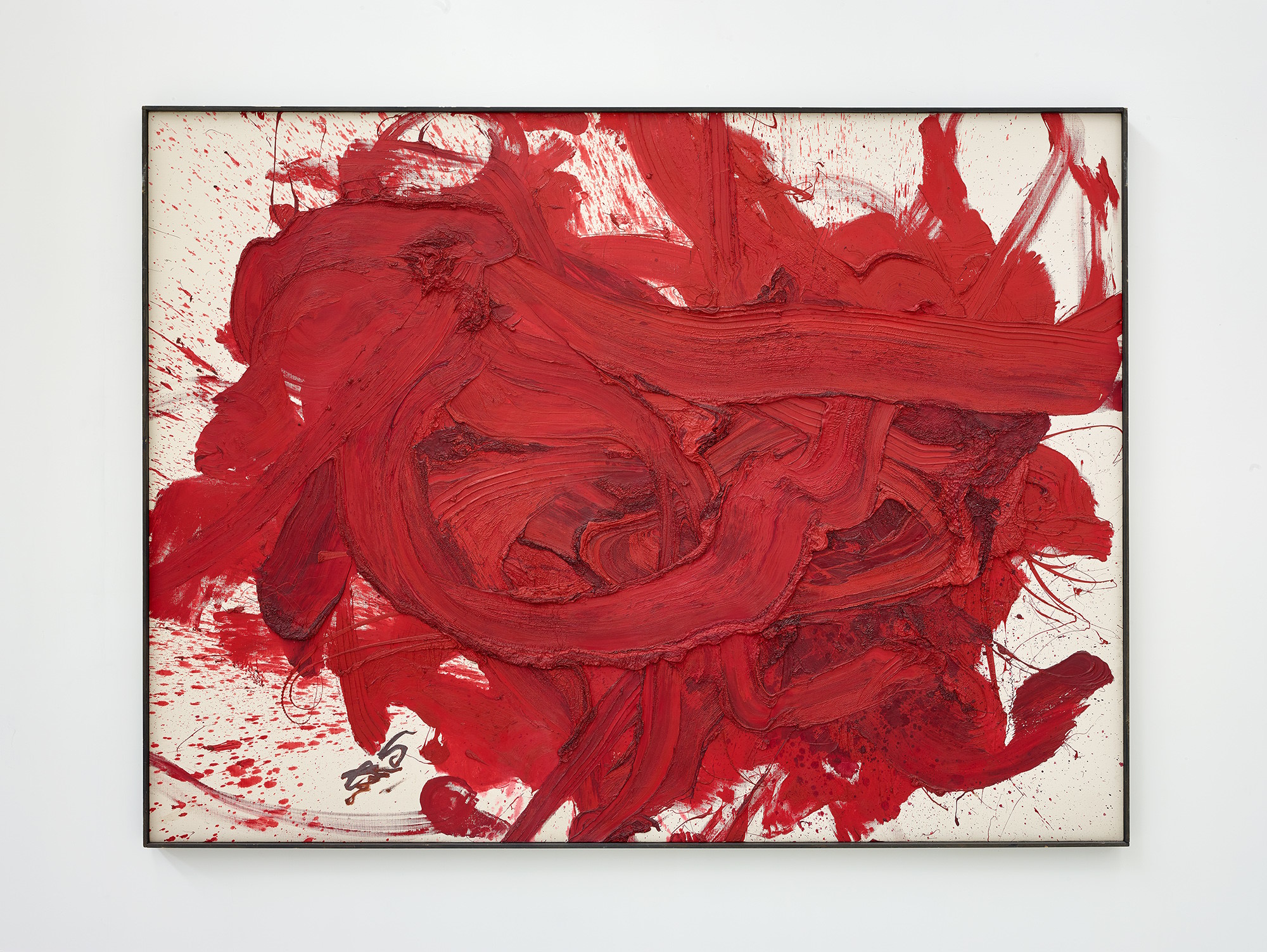
A new generation of artists is breathing life into a centuries-old subject: florals. The works, which range from traditional botanicals to avant-garde abstractions and edgy photographic images, are intimate portraits of nature in all its glorious phases. Stockholm-based photographer Carl Kleiner often employs flowers in his works, creating undulating images with stems and petals in impossibly whimsical positions. Belfast painter Ted Pim has been creating oil-on-canvas rose bouquets for the past 15 years. The works, which sell for US$3,000 to US$22,000, are brutally brooding and literally dripping with subtle significance.
“Roses are a symbol of love but also can be incredibly dark,” he says. “I grew up listening to Tarot readings my friend’s grandmother did, and I learned that the rose is a symbol of balance. It expresses promise, new beginnings and hope. Its thorns represent defense, physicality, loss, and thoughtlessness. I use these themes in my work to create beautiful pieces of art.”
Inspired by 18th-century works of Dutch painter Rachel Ruysch, Pim deliberately flaws “perfect floral scenes, with every inch analyzed and overanalyzed for imperfections” by dripping a mixture of etching ink and white spirits over the work at the end to emphasize the unpredictability and fragility of life. “It’s a thrill to pour the mixture over the oils, trying to balance the elements of destruction and creation,” he says. “A lot of people would ask if the flowers I paint are dying or coming to life. I like that they have to make up their own minds.”
Belfast-based artist Ted Pim paints striking oil-on-canvas rose bouquets.
ARCHITECTURE
The so-called modern farmhouse is one of the latest manifestations of the quest to create a classical, comfortable residence that is suitable for casual, contemporary life
The hybrid houses, which are, on the outside, spare and Shaker simple, feature opulent, open-plan interiors and are sited to exploit the sun and the natural breezes.
“Modern farmhouses combine traditional forms with the clarity, simplicity, and openness of Mid-Century Modern architecture,” says architect Matthew Griffith, a principal of in situ studio in Raleigh, N.C. “Farmhouses were not meant to be decorative—they were practical, and they were beautiful, quiet places.”
The wood-sided structures, which typically have durable metal roofs, take design cues from vernacular farmhouses, yet look more austerely elegant than agrarian.
A modern farmhouse from North Carolina-based in situ
“The interior spaces are not always one room,” Griffith says, noting that in one in situ studio project, a stairway serves as an architectural connector.
He says that the form, which blends indoor and outdoor spaces, has become so popular that “it’s a movement—developers of spec properties are using the term ‘modern farmhouse’ to describe them. Five years ago, when we designed our first one at a client’s behest, it was a novelty.”
DESIGN
The rooms we live in should not simply be seen but also appeal to the emotions. That’s the credo of experiential design, whose spaces stimulate the five senses.
Becky Shea, whose eponymous design firm is based in New York City and Los Angeles, sees such design as “holistic therapy” that creates “a subconscious calm.”
In her interiors, she evokes memories with, among other cues, materials, meditative ambient sound, living walls, and a signature scent diffused through the HVAC system.
Becky Shea used old flooring that meant something to her clients to create built-ins in a breakfast room.
In one project where her clients were renovating the family home, she used its old flooring to create built-in cabinetry for the breakfast room. “Now, every day, they are reminded of the memories that were created on the floors,” she says.
For another home, she designed an oversize custom rug that matched the material of the client’s favorite sweater. “She told us how much she loves the experience of waking up and wiggling her toes in the plush alpaca boucle before starting her day,” Shea says.
Digging deeply into the client’s psyche is key to the process. “If conventional design is like dating, experiential design is more like being married with two kids and a pet,” she says. “We get to know every detail about our clients from what kind of deodorant they use to where they vacationed as children.” Shea says she knows the design is successful “when clients tell us they’ve never felt more ‘at home.’”